Agent Tools: Strengthening the Agent-Client Relationship
B2B
Product Strategy
Delivered
Industry
Real Estate Tech
Client
Movoto Real Estate
The Setup
In April 2024, leadership kicked off a new initiative: how to better support the relationship between agents and their clients. For me, that meant a sudden pivot. I'd spent nine years at Movoto designing for consumers, a user I knew intuitively, almost reflexively. Agents were a user I understood conceptually but had never designed for directly. I had to rebuild my intuition from scratch. Their workflows, their pressures, their relationship with the app, none of it was where my instincts were calibrated. I was nervous. I leaned in anyway.
The Challenge
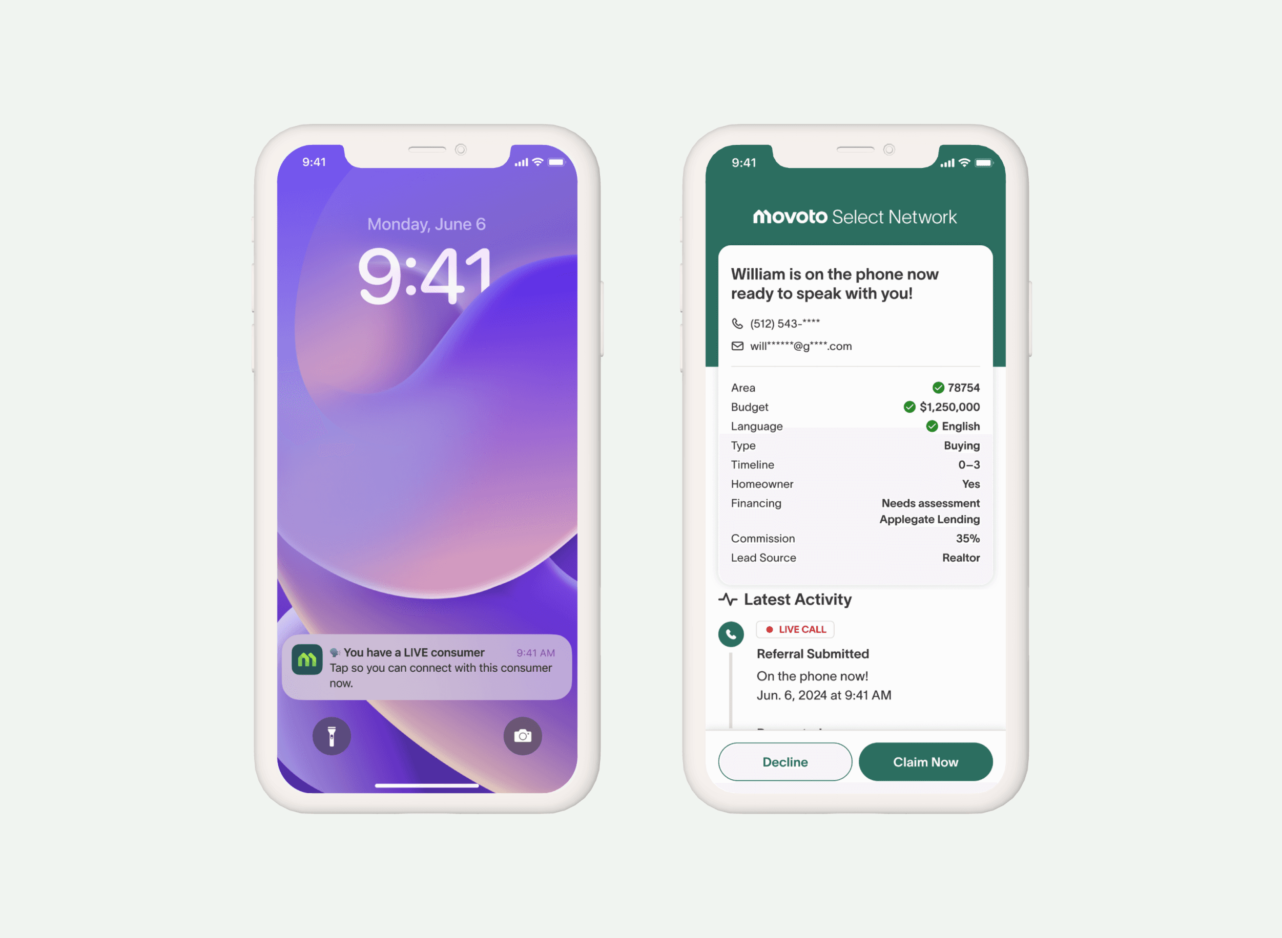
The data made the urgency undeniable. Warm introductions were 4–5x more likely to close than cold leads. Showings within 14 days were 20x more likely to close. In real estate, timing isn't just important, it's often the difference between a deal happening and a deal evaporating. Yet agents had no real-time visibility into what their clients were doing. When a client saved a home, requested a tour, or showed signs of serious engagement, the agent often didn't know until it was too late to act. The tools existed, but they lived on web, slow, fragmented, and disconnected from how agents actually moved through their day.

What I did
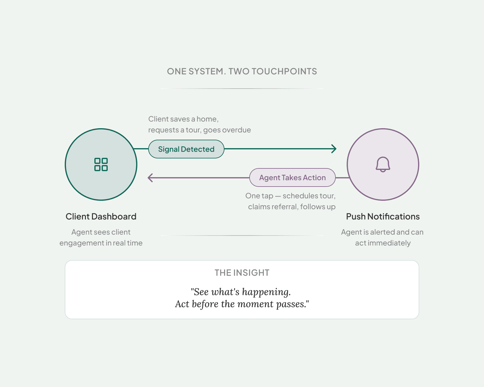
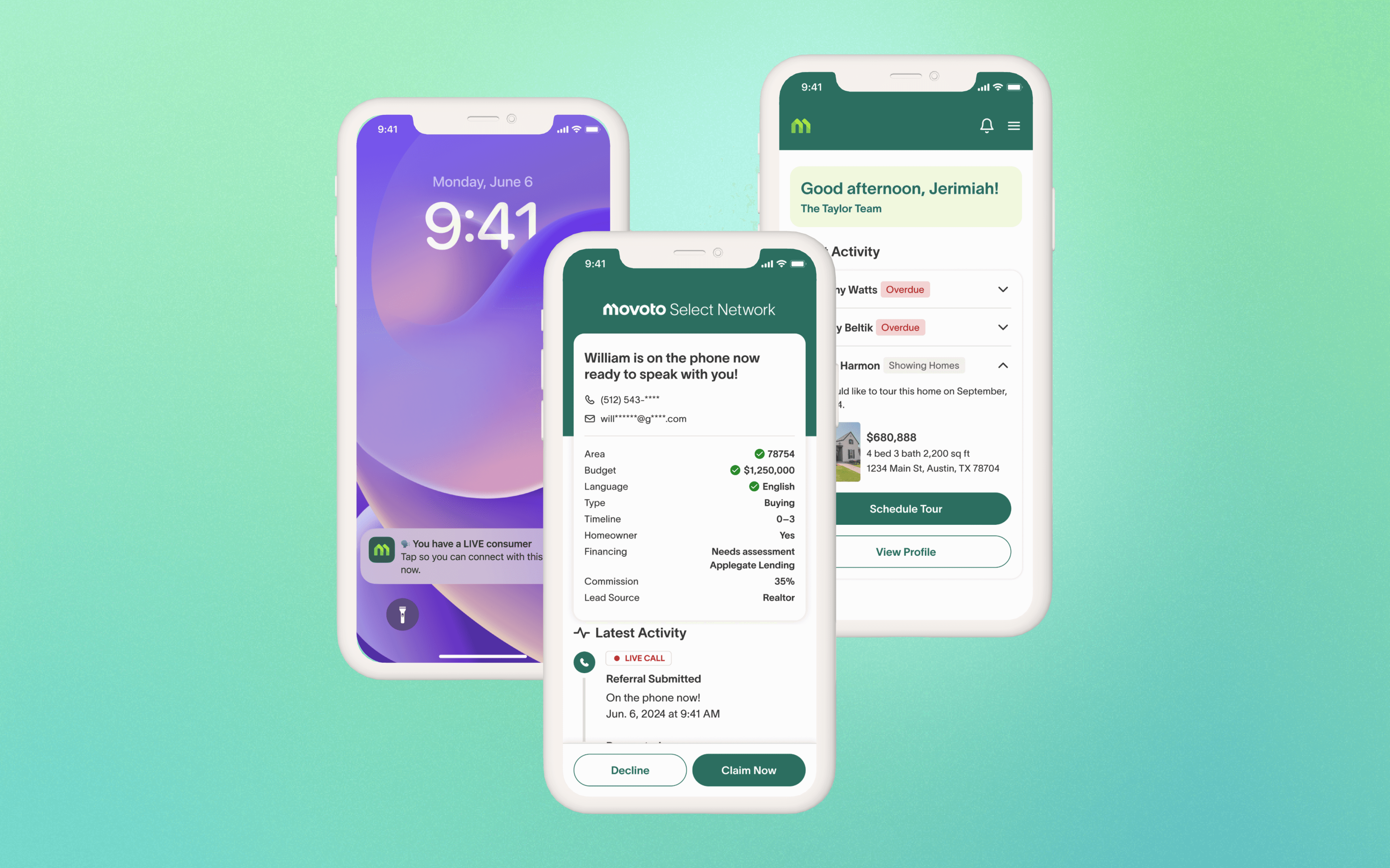
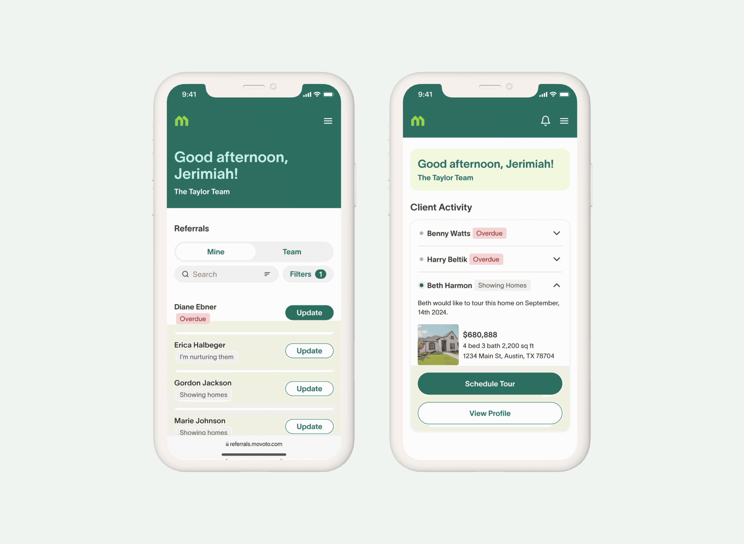
The first thing I had to design was my own understanding. Consumers and agents look at the same app and see two different products. A consumer is browsing; an agent is running a business. Every moment in the app has a cost attached to it. Once that distinction clicked, the design problem clarified into two connected gaps, visibility and action, and I designed a feature for each. The Client Dashboard gave agents a centralized view of client engagement, prioritized so they could see who needed attention without digging through individual profiles or relying on memory. The hard design call wasn't what to show, it was what to leave out. Every element on that screen had to earn its place against an agent's time.
Push Notifications closed the action gap. Agents were drowning in SMS alerts, repetitive, undifferentiated, easy to ignore. Claiming a referral meant opening a text, tapping a link, getting redirected to a browser, and navigating to the right screen. The redesign brought agent tools into the native app and replaced that multi-step redirect with a single tap that landed agents exactly where they needed to be. The harder design problem wasn't the UI. It was the notification hierarchy, figuring out which signals deserved interruption and which didn't. That decision required understanding how agents actually prioritize their day, which is the kind of thing you can't shortcut by reading a brief.